Gnuplot Tutorial
Part 2 - Plotting data
In part 2 of this tutorial the focus is on plotting data, by the end we will be able to use gnuplot to produce a graph whose quality is acceptable for scientific publication. Also included are a few tricks on how to plot complex data files.
1. Plotting data
Download the Example data file and follow the example. To plot the first two columns open gnuplot and type:
gnuplot> plot 'example1.txt' using 1:2
Since the values in the first two columns are all the same, this should produce a graph with just one point, if you are following the tutorial and this command produces an error it may be because you missed a step, and are still in the radial graph mode, you need to type 'reset' or exit and restart gnuplot.
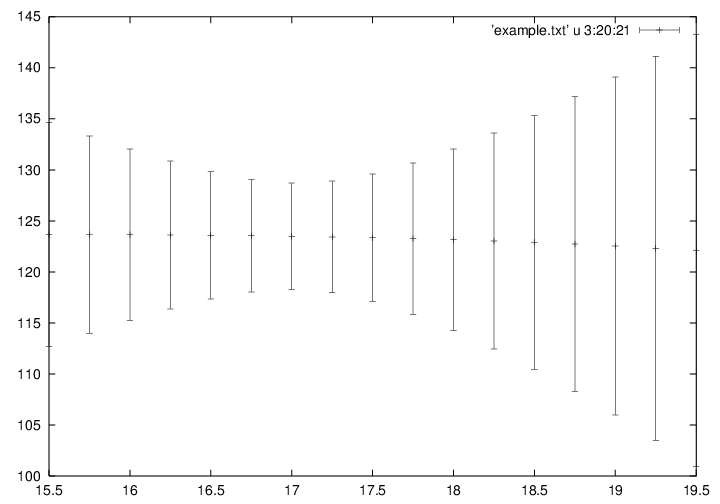
What we want to do it plot the 20th column against the 3rd colum, using the 21st column an error bar, this produces the ouput below:
gnuplot> plot 'example1.txt' using 3:20:21 with yerror
2. Tip - Abreviating commands
Commands can be abbreviated as long as there is no ambiguities about which command/option you are calling. For example, the above can be written:
gnuplot> pl 'example.txt' u 3:20:21 w yerr
but not
gnuplot> pl 'example.txt' u 3:20:21 w y
3. Using scripts and macros
Important advice: use scripts, don't use gnuplot interactive interface. What this means: instead of entering your commands at the prompt, write them in a text file. Then, open gnuplot and enter:
gnuplot> call 'script_file'
Or alternatively you can get gnuplot to use the script from the command line and then exit, which ever way you prefer, you need to be aware that there are some differences in these two types of scripts. On the command line, type:
[00:00:01]{comp:user}$gnuplot script_file
This will save you a lot of time and will come very handy if you want to modify your graph a month after you produced the first one.
4. Formatting the graph using the postscript terminal
As we saw in part 1 of the tutorial, gnuplot outputs to a terminal, gnuplot generally refers to the program which should be able to understand the output. The default is X11, which is your screen. There are numerous alternative (see the gnuplot reference manual for more). One of the more flexible ouput terminals is postscript, which allows use many different fonts. Even if ultimately you which to produce a different graphic format, the flexibility of the postscript terminal can still make it a better choice. Conversion can be performed later (e.g. using convert: convert example.ps example.gif). Create a file in your text editor of choice, and start your script with:
reset
set term postscript portrait enhanced mono "Times-Roman" 22
set size 1,0.6
set output "example.ps"
Here 'reset' sets the settings to the defaults. For each possible terminal, there is a plethora of options (again, see the reference manual). Here we select paper orientation portrait, postscript version enhanced (needed to get sub and superscripts), mono as opposed to color, the font will be "Times-Roman" with size 22.
I don't like the default size of the graphs in portrait mode, so I always resize to get the vertical dimension similar to or less than that of the horizontal one.
Then we define the output, that is the name of the file, otherwise the postscript will be directed to your terminal, not very useful.
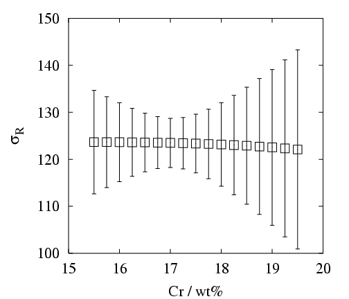
5. Axis, labels etc..
The axis or labels in the first figure are not that great: font is small, the presence of non-integer values is not really needed, and there is no label. Let's add to our script:
set xrange [15:20]
set xtics (15,16,17,18,19,20)
set xlabel "Cr / wt%"
set yrange [100:150]
set ytics (100,110,120,130,140,150)
set ylabel "{/Symbol s}_{R}"
set xrange [15:20]
Most of it is self-explanatory. Note that only need the 'set xtics..' bit if gnuplot doesn't get it right, which is the case half of the time. Note the ylabel, in which we use another font to produce sigma, and the possibilities offered by the enhanced postscript to get subscripts.
In this simple example, we don't need a legend, nor do we need to carefully chose the different points we want to use, since we only have one series. However, the default point is a rather ugly cross which is hardly seen when errorbars are used. Let's add the following to our scripts:
set linestyle 1 linetype 1 linewidth 1 pointstyle 4 pointsize 1
or:
set ls 1 lt 1 lw 1 pt 4 ps 1Now we are ready to plot so add:
plot 'example.txt' using 3:20:21 title "" with yerrorbar
Running the script as shown above will now produce the graph as below.
Many thanks to Thomas Sourmail, who wrote most of this part of the tutorial. Now that we have introduced the basics of gnuplot, plotting data and using scripts/macros, lets see some other ways of using gnuplot, and see some more examples, On to part 3!